DataFrame数据如何绘制按时间趋势的折线图,今天以weibo数据集为例,绘制微博文本内容折线图
- 微博文本内容「平均长度随时间变化」
- 微博文本内容「平均情感分值随时间变化」


一、准备工作
1.1 下载数据集
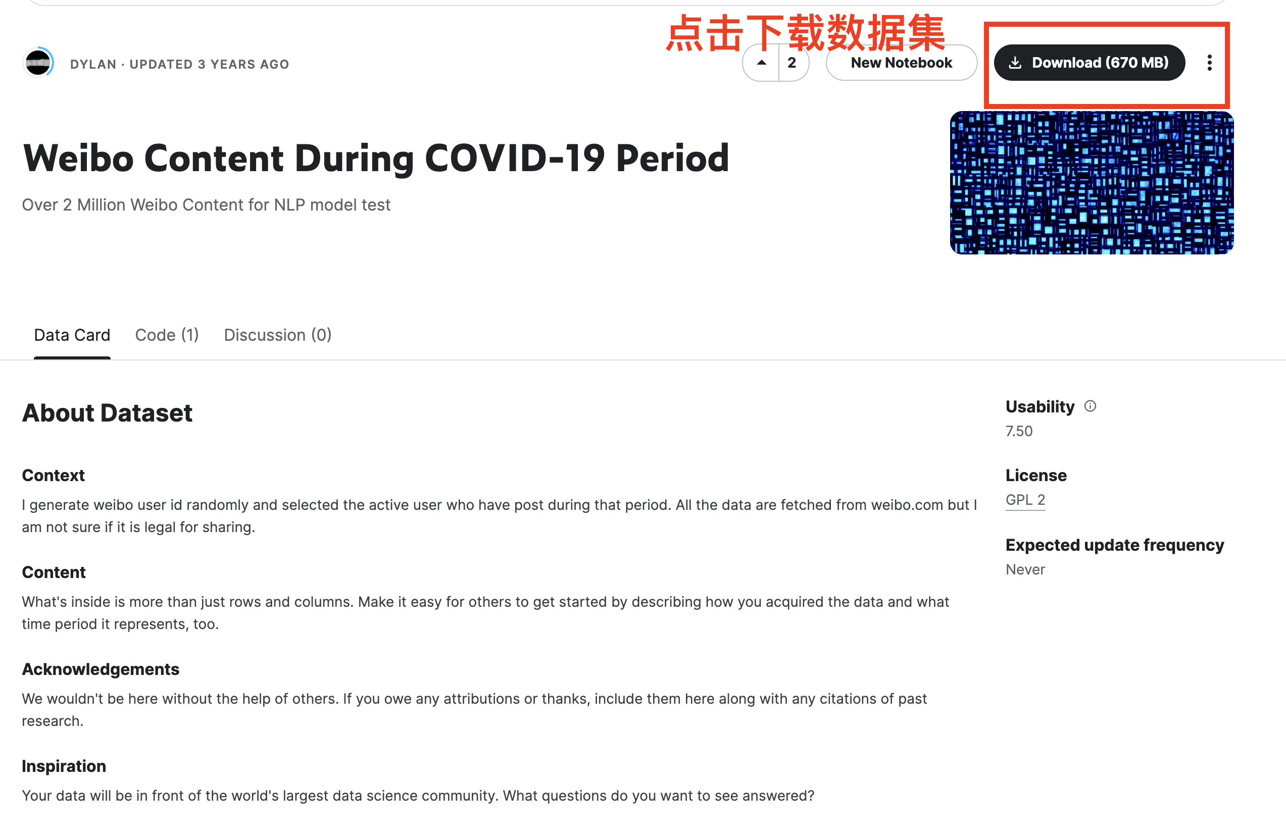
数据集下载链接 https://www.kaggle.com/datasets/dylanli/weibo-content-during-covid19-period
含8个json文件
- user1.json、user2.json、user3.json、user4.json
- weibo1.json、weibo2.json、weibo3.json、weibo4.json
这里仅尝试读取weibo1.json
import os

os.listdir()
['weibo2.json',
 '.DS_Store',
 'weibo3.json',
 'Untitled.ipynb',
 'weibo4.json',
 'user1.json',
 'user2.json',
 '说明.md',
 'user3.json',
 '.ipynb_checkpoints',
 'user4.json',
 'weibo1.json']
1.2 导入数据
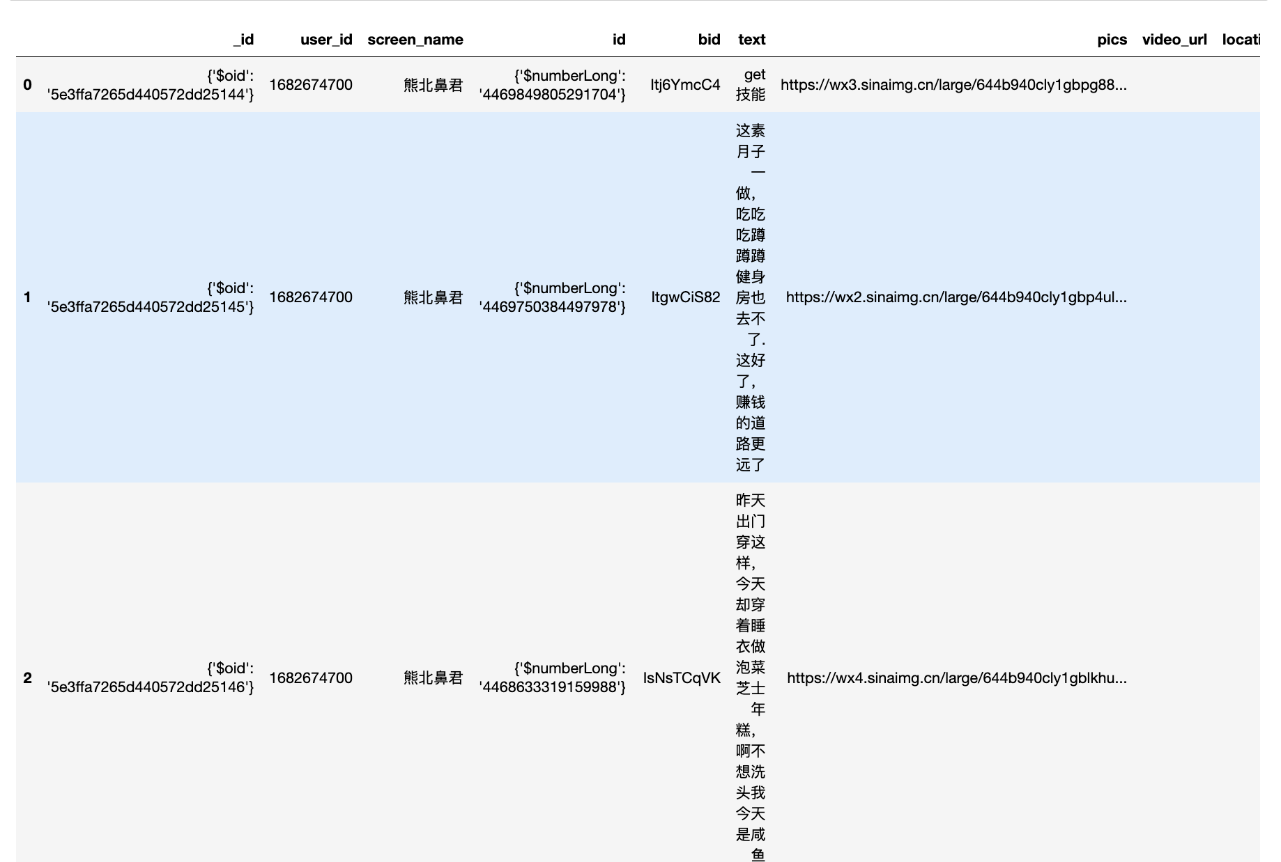
导入 7138微博用户数据后,查看
- 数据量
- 字段的数据类型
import pandas as pd

weibo_df = pd.read_json('weibo1.json')
weibo_df.head()
#记录数
len(weibo_df)
560840
#字段的数据类型
weibo_df.dtypes
_id                        object
user_id                    object
screen_name                object
id                         object
bid                        object
text                       object
pics                       object
video_url                  object
location                   object
created_at         datetime64[ns]
source                     object
attitudes_count             int64
comments_count              int64
reposts_count               int64
topics                     object
at_users                   object
retweet                    object
dtype: object
二、数据分析
绘制微博内容
- 平均长度随时间变化
- 平均情感分值随时间变化
2.1 平均长度随时间变化
import matplotlib.pyplot as plt
import matplotlib
import matplotlib_inline
matplotlib_inline.backend_inline.set_matplotlib_formats('png', 'svg')
import scienceplots
import platform

plt.style.use(['science', 'no-latex', 'cjk-sc-font'])
system = platform.system()  # 获取操作系统类型

if system == 'Windows':
    font = {'family': 'SimHei'}
elif system == 'Darwin':
    font = {'family': 'Arial Unicode MS'}
else:
    font = {'family': 'sans-serif'}
matplotlib.rc('font', **font)  # 设置全局字体


# 统计人均字符长度变化
#df['text_length'] = weibo_df['text'].apply(lambda x: len(x))
weibo_df['text_length'] = weibo_df['text'].str.len()
df_avg_length = weibo_df.groupby('created_at')['text_length'].mean().reset_index()

# 绘制人均字符长度变化图
plt.figure(figsize=(10, 5))
plt.plot(df_avg_length['created_at'], df_avg_length['text_length'])
plt.xlabel('日期')
plt.ylabel('微博内容平均长度')
plt.title('微博内容平均长度随时间变化')
plt.xticks(rotation=45)
plt.show()
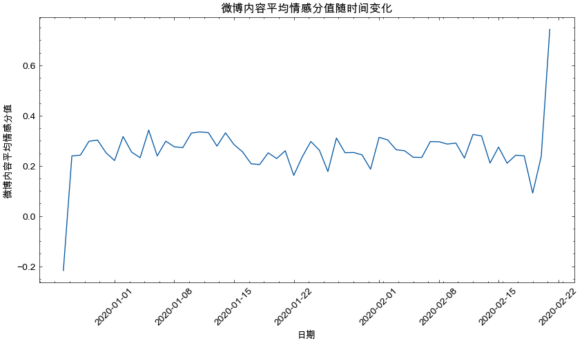
2.2 平均情感分值随时间变化
- 设计情感计算函数senti_score
- 测试一条文本的情感计算实验
- 推广到所有weibo内容的情感计算
- 参考「平均长度随时间变化」,会「平均情感分值随时间变化」
#pip3 install cntext==1.9.2
import cntext as ct
import jieba

#使用知网Hownet情感词典
pos_words = ct.load_pkl_dict('HOWNET.pkl')['HOWNET']['pos']
neg_words = ct.load_pkl_dict('HOWNET.pkl')['HOWNET']['neg']


def senti_score(text):
    pos,neg = 0,0
    words = jieba.lcut(text)
    for word in words:
        if word in pos_words:
            pos = pos + 1
        if word in neg_words:
            neg = neg + 1
    #(pos-neg)/(pos+neg)即可,为防止分母为0,特加1
    return (pos-neg)/(pos+neg+1)


print(senti_score(text='我很开心!'))
print(senti_score(text='我很难过!'))
0.5
-0.5
len(weibo1_df)
560840
import matplotlib.pyplot as plt
import matplotlib
import matplotlib_inline
matplotlib_inline.backend_inline.set_matplotlib_formats('png', 'svg')
import scienceplots
import platform
import numpy as np

#一共有560840条推特,这个部分代码运算量比较大,你所看到的情感变化图是按照1%随机抽样绘制的结果。
#按照1%随机抽样绘制的结果,
#np.random.seed(666)
#weibo_df = weibo_df.sample(frac=0.01)

plt.style.use(['science', 'no-latex', 'cjk-sc-font'])
system = platform.system()  # 获取操作系统类型

if system == 'Windows':
    font = {'family': 'SimHei'}
elif system == 'Darwin':
    font = {'family': 'Arial Unicode MS'}
else:
    font = {'family': 'sans-serif'}
matplotlib.rc('font', **font)  # 设置全局字体


# 统计平均情感分值
weibo_df['senti'] = weibo_df['text'].apply(senti_score)
df_senti_avg_length = weibo_df.groupby('created_at')['senti'].mean().reset_index()

# 绘制平均情感分值随时间变化
plt.figure(figsize=(10, 5))
plt.plot(df_senti_avg_length['created_at'], df_senti_avg_length['senti'])
plt.xlabel('日期')
plt.ylabel('微博内容平均情感分值')
plt.title('微博内容平均情感分值随时间变化')
plt.xticks(rotation=45)
plt.show()